
How we improved BuildBook’s retention and trial-to-paid conversion

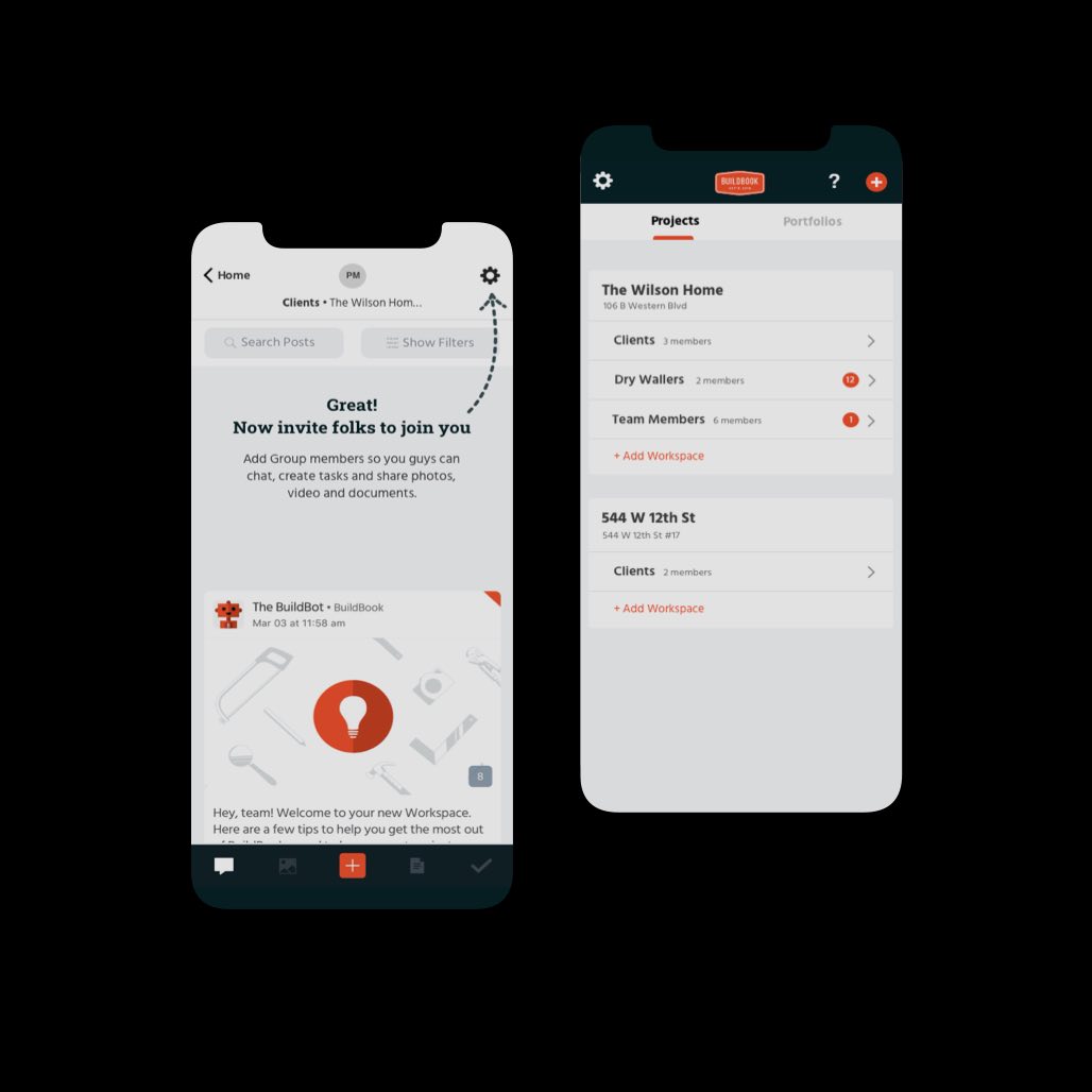


BuildBook is a mobile and web-based service that helps residential construction teams manage projects and communicate better.
They were enjoying great weekly engagement and inbound traffic, but the percentage of trial users that made it past one session was too low.
We streamlined their web-to-mobile onboarding process and optimized much of their product’s core UX—helping more users reach their “Aha!” moment and convert to paid accounts.
“Simple Circle dug deep and made a real difference with our trial-to-paid conversion. ⭐⭐⭐⭐⭐”

Based on segmented retention analysis, we learned that trial users who invited a client to a workspace and discussed several project updates, converted to paid accounts at double the rate of other users.
This helped us understand which actions BuildBook’s most-successful users take (that others don’t)—enabling us to define our activation events and focus our testing and design on improving the most important parts of the app.

Once we knew which user actions led to conversion, we were able to analyze the enabling flows—looking for areas of friction and opportunities for improvement.
The process revealed a worrisome drop-off as users tried to segue from the web-based signup flow to the app. Following that, we noticed another problem when users tried to invite clients to join them in the app.
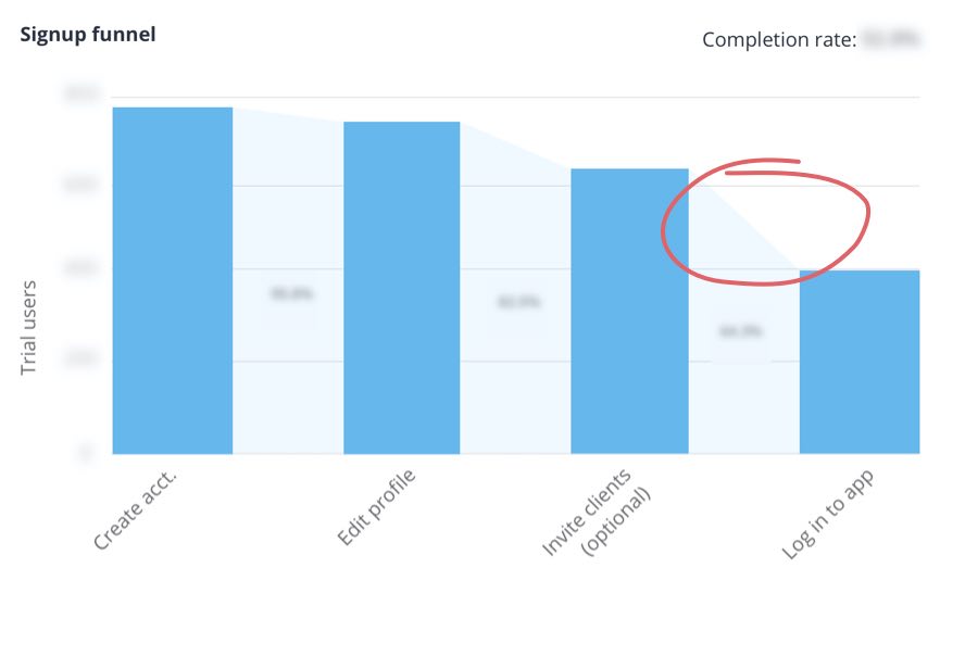

Coupled with our initial onboarding audit and churned-user surveys, we learned something about what worked and a bit about why. We were now set up to look into, and improve, the right areas during the user testing and design stage.
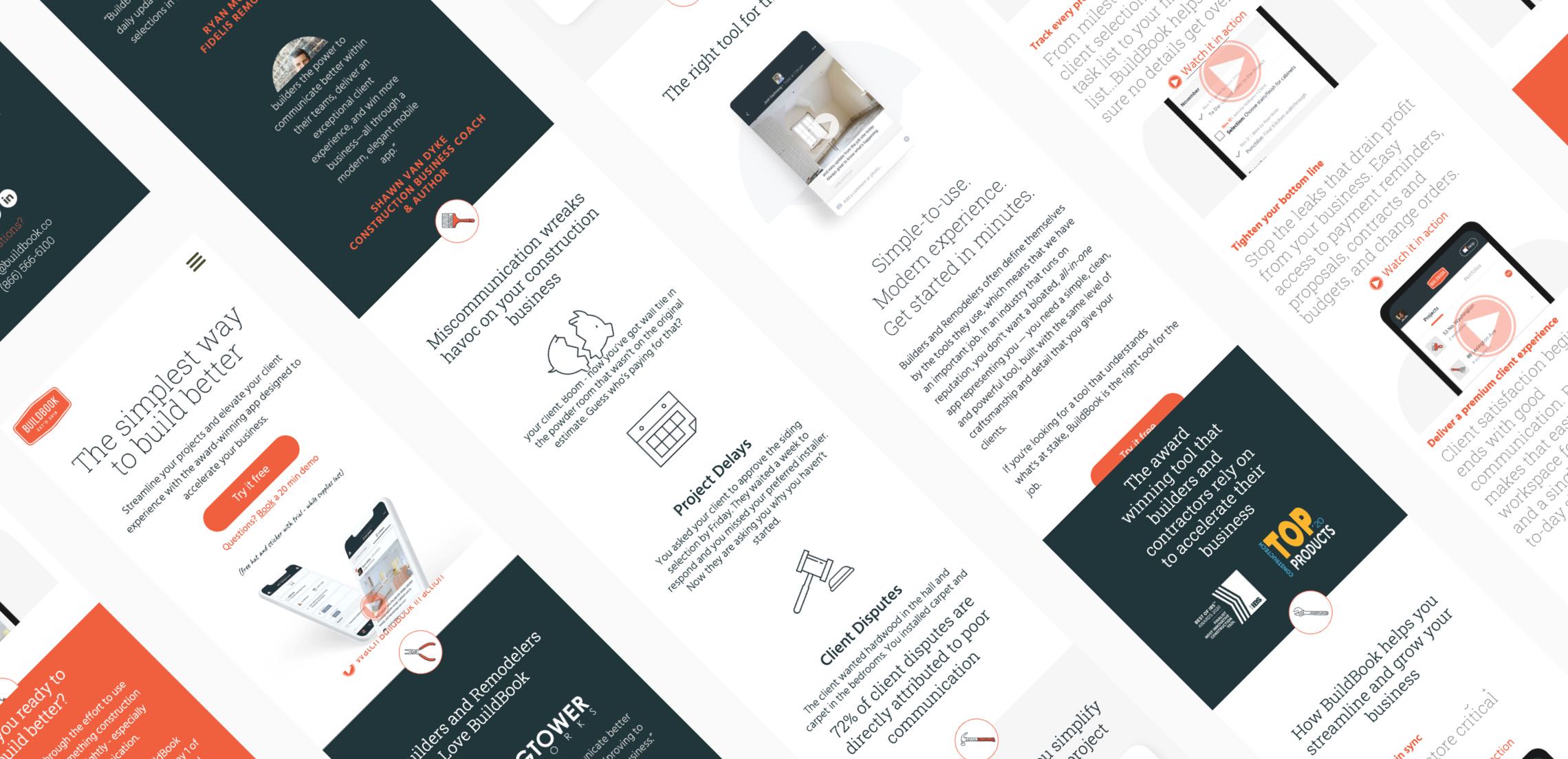
BuildBook’s general promise proved enticing to test participants, but a lack of detail around the product’s features lead to confusion and prevented folks from accurately answering many of our “check for understanding” questions.
Although homepage copywriting and design wasn’t in the scope of this project, our testing enabled us to provide detailed recommendations that would help BuildBook present their offering more clearly and persuasively moving forward.
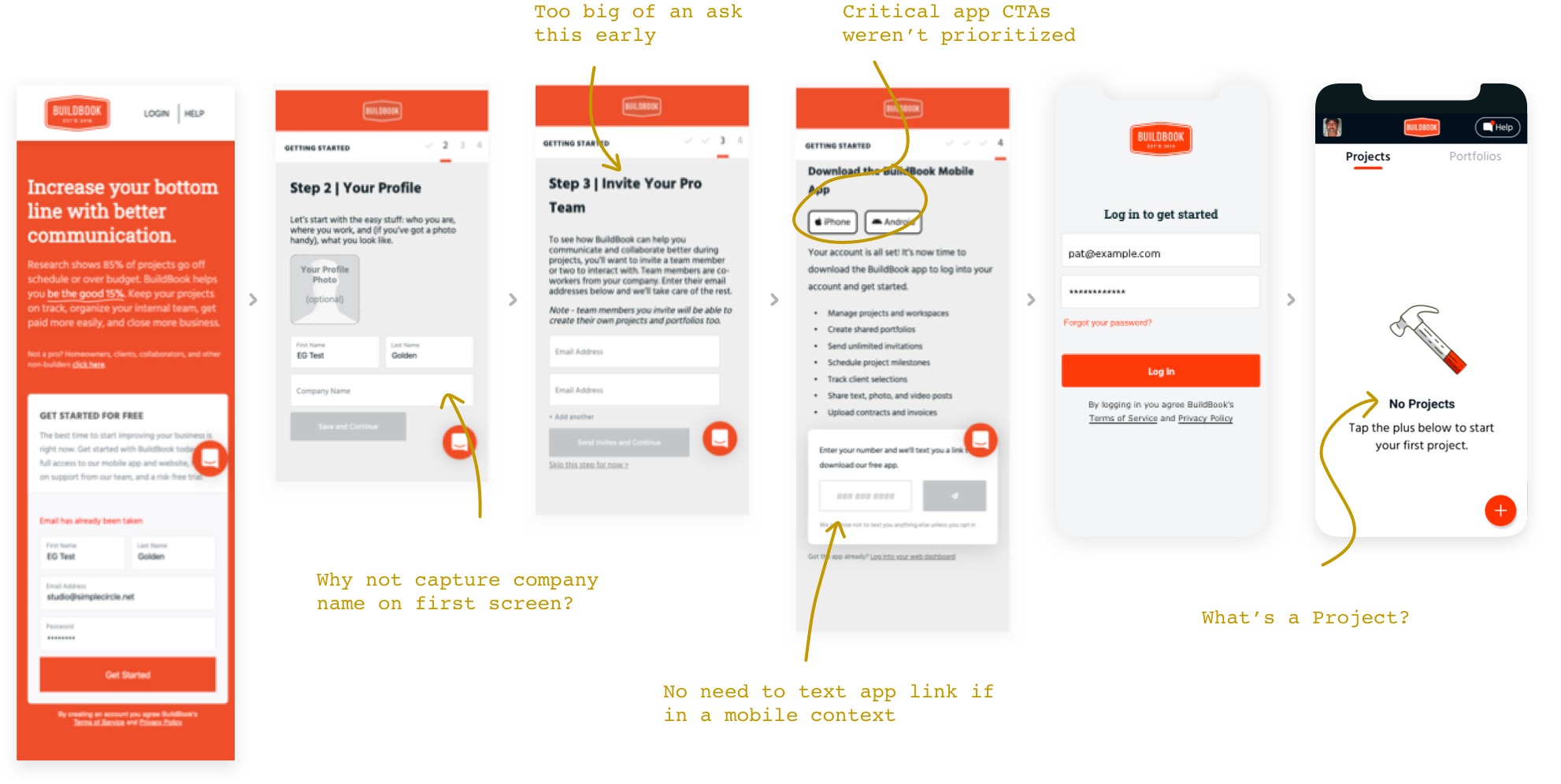
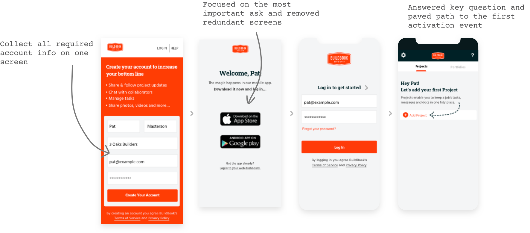
BuildBook’s onboarding begins with a web-based signup that prompts folks to install the app and go from there. Although not ideal in some respects, it plays into their larger dual-platform (web/native) plans and desire to avoid Apple’s high in-app purchase fees.
Our initial audit raised a couple of flags that were confirmed during user testing, namely around asks and friction that got in the way of the main app install CTA.
Read on to see what we learned (and delivered) based on two rounds of user testing and prototype iteration.
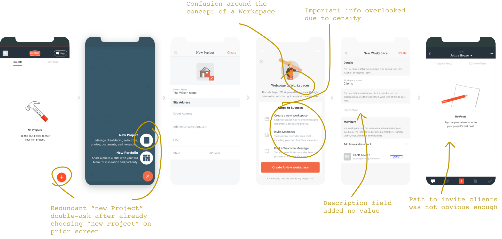
Creating an initial Project and Workspace is a new user’s first order of business. Although we didn’t uncover much tactical friction here, we did find notable confusion around the concept of a Workspace.
It’s important that users “get” Workspaces, because they enable much of the app’s core functionality and play a key role in securely routing messages and files to the intended recipients.
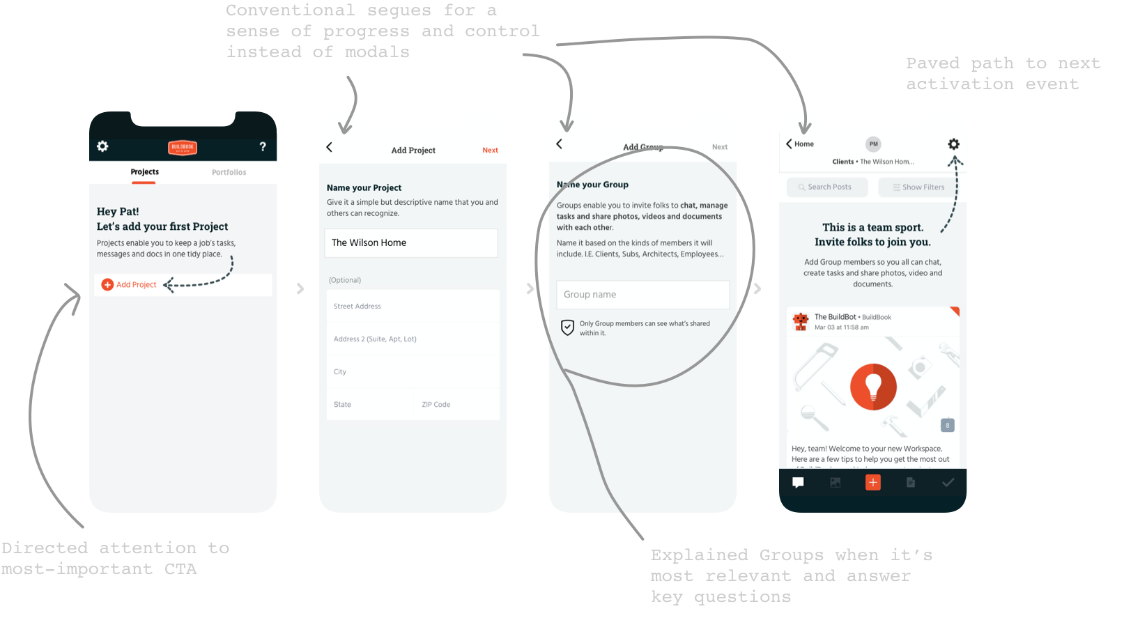
Turns out, by simply by renaming Workspace to Group, test participants readily understood the concept and correctly equated it to the group-chat model they’ve known for years. From there, we removed a couple redundant screens, communicated core concepts in a more bite-sized fashion, and explicitly set folks up to move into the next activation flow.
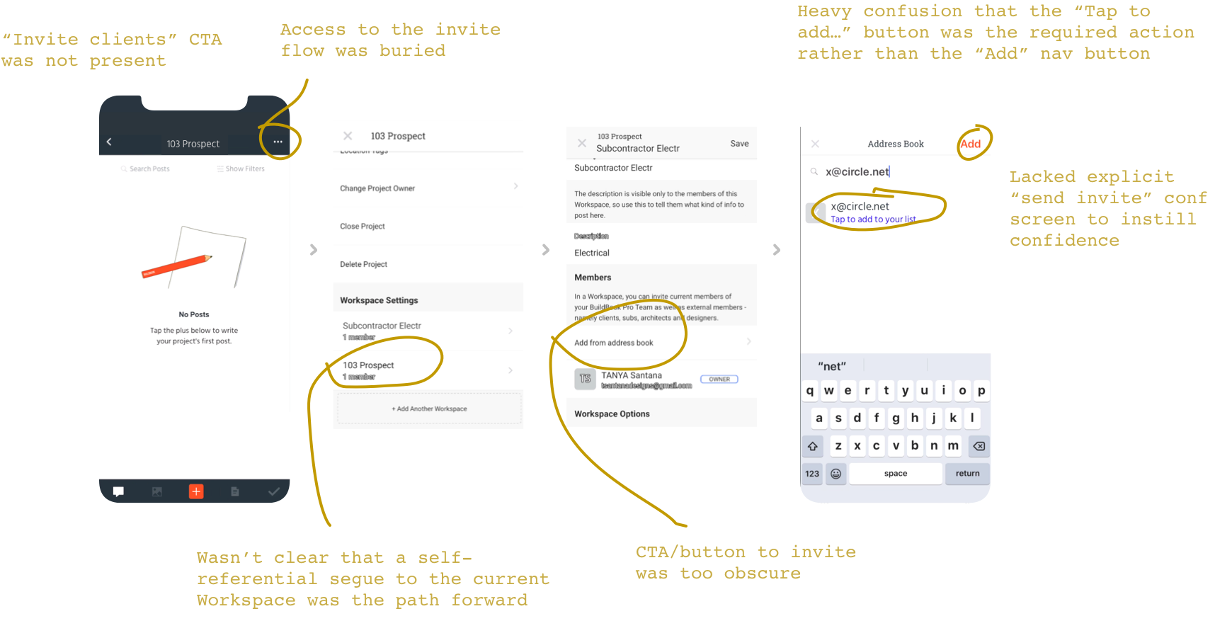
User testing revealed serious friction when trying to invite a client to a Workspace. Improving this flow played a big role in the results we were able to deliver.
We uncovered a few problems: there was no clear CTA or obvious way into the invite flow, and if users did find their way, they ended up in a loop of confusion that few could overcome.
Needless to say, we dug in on this. User testing confirmed our new design was working and enabled users to quickly and easily invite clients with confidence.

This is the last activation event. Although we had a few small suggestions for the team, testing revealed no meaningful issues, so we didn’t make any changes.
By eliminating the friction and confusion that was turning away interested users, the BuildBook team is now enjoying a range of boosted KPIs and is confidently focused on growing their business.
“I wish we could hire the whole team!”

Request a free call now. In preparation, we’ll audit your onboarding system, develop questions, and provide an actionable list of UX and messaging suggestions you can instantly put to work.
