
How Simple Citizen scaled by reducing support requests

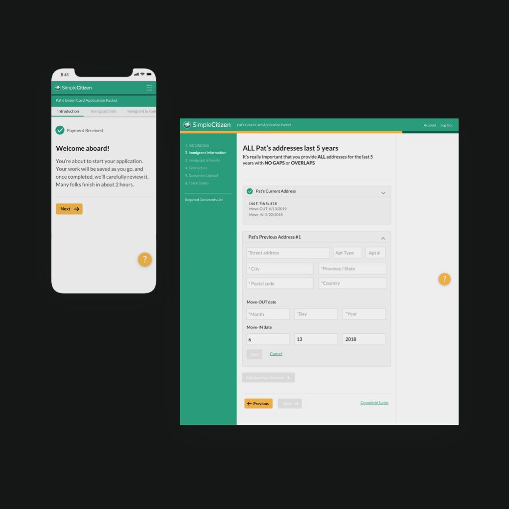


SimpleCitizen is an amazing service that automates the process of applying for U.S. Green Cards and visas.
Their support team was dealing with a ton of daily requests due to the required complexity of their 98-screen Green Card application process. They needed to lighten Support’s load so they could scale while keeping the 5-star referrals rolling in.
This project was unique for us, since we mainly take ones that cover a user’s entire onboarding journey (from lander to activation emails). However, since SimpleCitizen’s visitor-to-customer conversion rate was already through the roof, we skipped signup and jumped right to their core experience.
“Simple Circle brought a level of product thought that’s hard to come by, plus they got jokes! Solid team. 👍”

User testing plays a huge role in every project we take on. SimpleCitizen loved the testing process so much, they created this charming highlights video for a company-wide watch party.
The eye-opening event was a slam dunk. It aligned their various departments like never before and helped everyone connect with their anxious Green Card applicants in a new way.
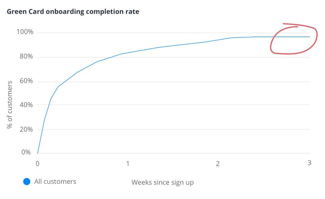
At 97%, SimpleCitizen’s Green Card onboarding-completion rate was extremely high. Since applicants were beyond motivated and had already paid for the service in full, they almost always completed the process—leaving little room or reason to improve this metric.
Being the case, we didn’t need to conduct our usual retention analysis to boost conversion. We just needed to ensure customers could easily complete the process and provide accurate info with as little help from Support as possible.
After auditing the entire 98-screen experience and talking with their team, we aligned on activation events that would not only help customers nail the SimpleCitizen experience, but also prepare them for next steps with the U.S. government.
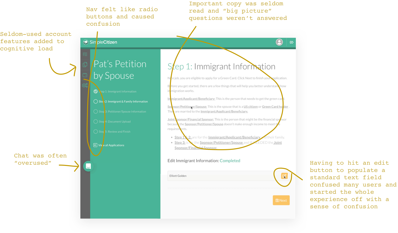
SimpleCitizen’s Green Card application process takes about two hours, is tedious, and touches on various concepts applicants must understand.
Educating them up front makes the process easier.
But, applicants were overlooking important info in the current design because it front-loaded too much content (AKA directions) on screen one.
To make sure they didn’t miss things, we used progressive disclosure to reveal the right content in the right context over multiple screens—helping them learn by doing.
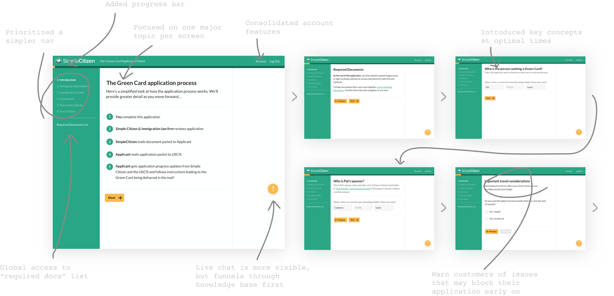
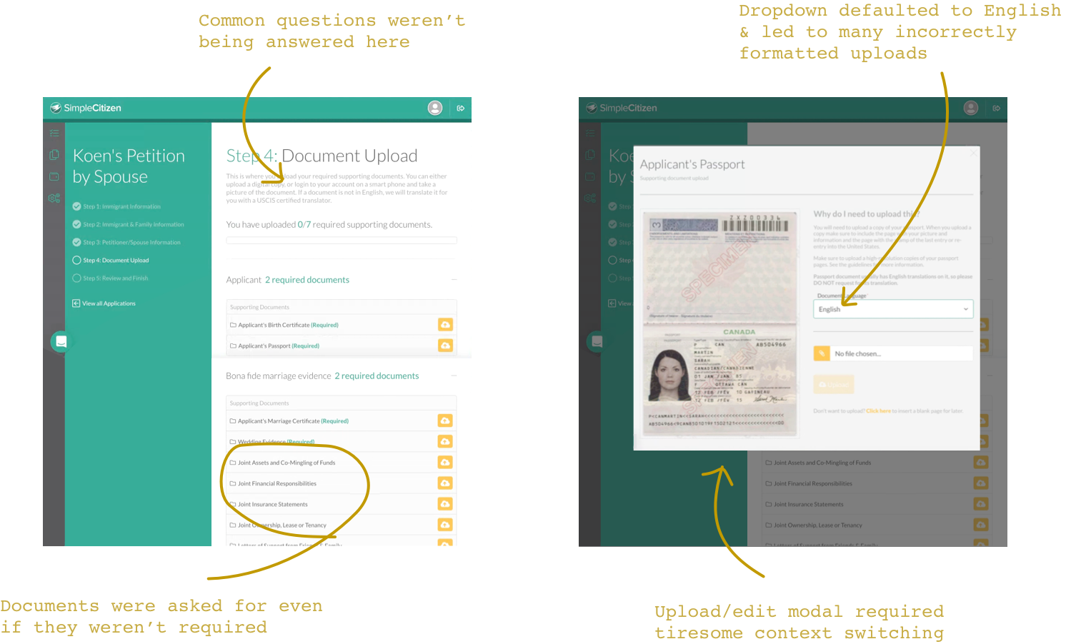
The application process has a couple of main sections. One is heavy on text input, the other file uploading. Although we found and addressed some friction in the text sections, we uncovered the biggest chance for improvement in the document section.
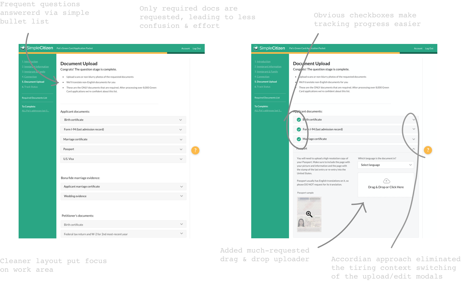
In the document list, some items were labeled required, some weren’t. This concerned applicants, because they wanted to do everything they could to get their Green Card, but it wasn’t clear if going through the effort of uploading non-required docs would help or hurt their case.
We worked with SimpleCitizen to narrow the list to only required docs and made the upload and edit process more conventional and easier to use.
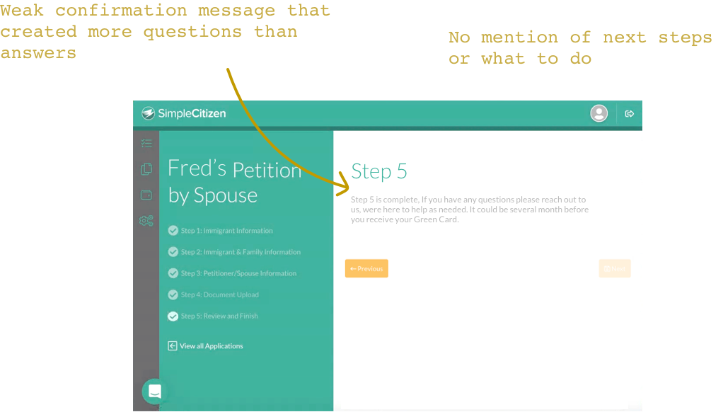
The last screen of the flow is where the entire application is submitted to SimpleCitizen. Problem was, it lacked a rock-solid confirmation moment and often left anxious Green Card applicants unsure if things had gone through.
This end screen also missed an opportunity to educate folks on what to expect and do over the coming months as the government processed their case.
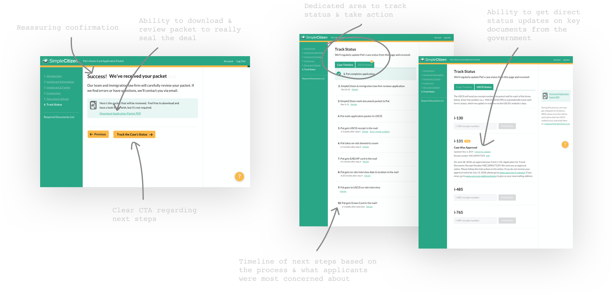
To remedy this, we designed a proper confirmation screen that enabled folks to download and review the packet, plus a status tracker that enabled them to follow their case and take next steps.
Applicants and the support team loved this, making it a big win.
Now that SimpleCitizen’s support team has fewer help requests to deal with, they can put more energy into helping higher-paying enterprise clients solve their problems—without hiring additional support staff.
“I wasn’t sure it’d be worth it, but they helped us fix hidden blockers and actually move the needle."

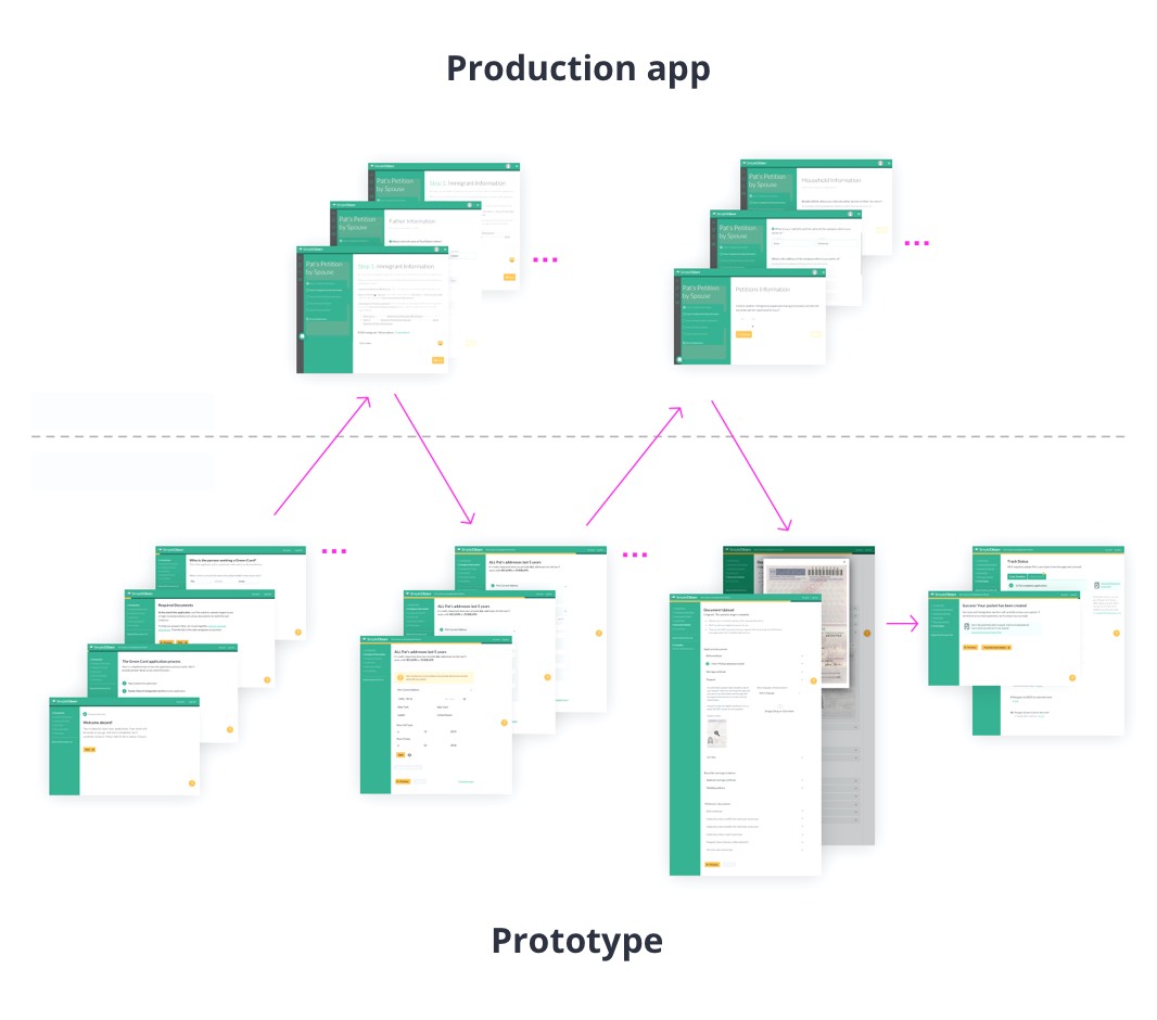
Prototyping and user testing large applications like SimpleCitizen’s can be difficult.
The trick is to design prototypes for the sections that require changes only (rather than the entire monolith).
Then, through artful moderation, direct participants from the live app into the prototype, and vice versa.
When done well, it enables a simulated realism that provides reliable learnings and a design approach that doesn’t waste time.
Request a free call now. In preparation, we’ll audit your onboarding system, develop questions, and provide an actionable list of UX and messaging suggestions you can instantly put to work.
